Introduction to Microsoft Power BI:
The Power Bi Data Engine is a self service Business Intelligence tool Offered by Microsoft that reveals the core aspects of Microsoft different apps through the Power Bi Platform .It includes Power BI Desktop and Excel as well. It is the foundation of the individual analytics reports and dashboards can be built up by your own self-help to track the pattern of the business processes, data mining, and visualizations by Power BI .
Microsoft Power BI has 3 main components which are: Power BI Desktop , Power Bi Service and Power BI Apps .
Power BI Desktop :
Power BI Desktop is a free Desktop Application used for building and designing the reports.
Power BI Service:
Power BI Service is the online publishing services for viewing and sharing the reports and also dashboards.
Power BI Mobile Apps:
Power BI Mobile Apps is used for viewing the reports and dashboards on the go.
Moreover Power Bi has two other elements which are :
PB Report Builder : Power BI Report builder development tool allows us to interact with Microsoft SQL Server Reporting Services data sources and use the service of that purchase to create an report that can read by the Power Bi Service.
PB Report Server: Power BI Report Server is an on-premises server, and after reports have been created using Power Bi Desktop, the reports can be published on that server.
What is Business Intelligence ?
Business intelligence (BI) is a technology driven process that enables companies to analyze data and provide practical recommendations. This involves gathering raw data from diverse sources such as databases and spreadsheets, cleaning it up and turning it into something useful, then using complex tools such as statistical analysis, data mining or predictive modeling to probe its depths. Thereafter, the findings are put in dashboards, charts reports and graphs for simplification of complex information and identification of trends as well as insights. Stakeholders who gain business insight through visualization can make better decisions on improving corporate performances. This has been made easier than ever before due to applications like Tableau, Power BI and QlikView.
Why we use Power BI?
In a modern world where globalization has become a universal phenomenon, data has a central position, There are assumptions that companies must have a tool that helps them extract the inherent meaning of the big volume of data they produce by using it. Microsoft Power BI was given its project to cater to companies’ requirements, it is a data visualization and analysis software that spans analytics and reports throughout the organization.
Some of the benefits of Power BI are:
- Power BI Desktop is a free tool that lets you create reports.
- It integrates data from different sources easily.
- Handles vast amounts of data running into tens of hundreds millions of rows.
- Comes with an impressive Data Analysis Expressions (DAX) language.
- Have unchangeable model’s data for security and integrity enhancement.
Comparison of Power BI with other BI tools:
In this section, a comparison is drawn between Power BI with other major Business Intelligence tools like Tableau, Excel and SSRS.
Tableau
While Power BI and Tableau are both business intelligence tools, and indeed a lot of the capabilities overlap between them, the two major key differentiators between these two are
Power BI works only on Windows, whereas Tableau works on both Windows and MacOS.
Pricing options differ between Power BI and Tableau; however, Tableau is generally more expensive in the majority of scenarios.
Excel
Much like Power BI, Excel is spreadsheet software that holds most of the native characteristics but poorly offers visualization options and further options for updating, sharing, and viewing reports and dashboards online.
SSRS
SSRS stands for SQL Server Reporting Services, which is a Microsoft-developed tool for creating data visualizations and reports, such as charts, tables, and graphs. It consists of a set of tools to create, distribute, and manage those reports. The tool gives insights into the information kept in SQL databases and fosters important and timely decisions based upon the reports generated by SSRS. This can also be used by experts, and by end-users.
Importing and Transforming the data in Power Bi Desktop:
Connect to data :There is a fairly extensive list of supported data sources and connections in Power BI, making it pretty easy to connect to any source of data of your choice. For this tutorial, we’re going to import some sample financial data provided by Microsoft to help learn Power BI.
First of all, you can download sample data and import it by selecting Excel as the data source, as was already mentioned in this tutorial. A window will pop up which previews what’s inside your Excel file. This allows you to select which table, or which Excel sheet you want to import. You can tell them apart because tables are indicated by this icon, and sheets are by this one. In general, it’s a bit better importing from tables since they are very structured in Excel—with headers and defined ends of row.
Step One :Open Power BI Desktop, From the Home menu, select Get Data, then Excel. Refer to the below screenshot for better understanding
Step Two: After selecting “Excel” in the data source option, a window will pop up that will show the Excel files on your device. Select any one of them.
Refer to the below screenshot for better understanding.
Step Three:A window will pop up where you will preview what is inside your Excel file.Then select the tables or sheets you want and click “Load” to load this data into Power BI Desktop.Refer to the below screenshot for better understanding.
Step Four:After loading data into Power BI Desktop, the Data view shows the table “Orders” with columns including “Row ID” and “Order Date”. All columns, such as “Category” and “Customer ID”, are listed in Data pane with a search box for easy navigation. There are also icons indicating data types—.sigma is for numeric fields. Column headers show dropdowns with both sort and filter options. See the screenshot below.
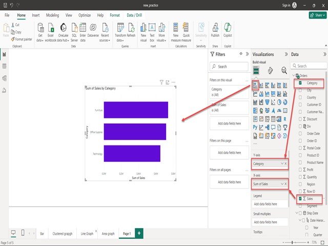
Step Five: AAfter selecting the specific data from your datasets, select a bar chart from the pane below for visualization. The result will be displayed in the bar chart.Refer to the below Screenshot for better understanding.
Importing the data from relational databases.
Connection can be made through Power BI to various types of relational data sources. These are essentially databases where the information moderated is organized into tables. Each database table will have multiple columns, and every row will house some certain data entry.
If your business or organization uses relational databases for sales analysis, Power BI Desktop can directly connect to your relational databases; there is no need to export flat files. This type of connection is useful for monitoring business progress, trends, and forecasting sales, enabling budgeting and performance targets. Power BI Desktop supports various relational databases, both in the cloud and on-premises.
Steps to import data from relational database
In Power BI Desktop, to access the data of a relational database, select “Get Data” and then select an item that will connect to the correct type of database. Here, in this case:
- Go to Home > Get Data > SQL Server.
Look at the below screenshot for better understanding.
- Next, configure the connection to your SQL Server database with the following:
Enter connection details: In the SQL Server Database window you fill in the server name and optionally the database name.
You can select the data connection mode: The user will select either ‘Import’ or DirectQuery’. In most cases, the user will select the ‘Import’ option.
Extended options:You can find more advanced options in the SQL Server Database window, which you may safely ignore for this simple setup.
On entering the name of your server and the database, you will be asked for your credentials. There are three options again that this step will present you with, which are:
Windows , Database , and Microsoft Account .
Select your sign-in option, then enter your username and password, and click on Connect.
Look at below screenshot for better understanding.
Select an data to Import
If the database has been successfully connected to Power BI Desktop, the Navigator window will list the available data in your data source, which for this example is the SQL database. You can then select a table or even an entity, preview what it is filled with, and make sure that only the correct data is loaded into the Power BI model. Select the checkbox(es) of the table(s) that you would like to import into the Power BI Desktop. Then click on the “Load” or “Transform Data” option..
Look at the below screenshot for better understanding.
Import data by using SQL Query
You can also import data using an SQL query. Actually, this is extremely useful when you know in advance which tables and columns of data you will need. The SQL Server Database Window can be opened as follows:
Enter server and database names. Click the arrow next to Advanced options. Compose SQL Query
In the box SQL statement, enter your query.
Example: SELECT ID, NAME, SALESAMOUNT FROM SALES.
Execute Query:
Now, click OK to load in Power BI exactly the specified data.
Look at below screenshot for better understanding.
Importing the data from text files:
On the Power BI visualization page, on the Home tab, click Get Data. Click Text/CSV, or you can click More to open the Get Data window; in it, select Text/CSV, then click on Connect.
Look at the below screenshot for better understanding.
Steps before Importing the Data:
Before we can import data from a text file into Power BI, let’s look over exactly what we have in the sample_data.txt text file.
After clicking on the Connect button, this will again pop up a window for choosing a text file from your file system. Now select sample_data.txt. Kindly wait for the connection to become ready. Look at the below Screenshot for better understanding. .
You can now preview the data. Normally Power BI detects the delimiter and separates columns correctly. If necessary, adjust delimiter settings. If the data looks good and so are the types, click Load.Look at the below screenshot for better understanding.
After clicking Load, the connection will be established, and an overview of your imported text file will be given. Consider the screenshot below for this.
Importing the Data from Data Feed.
Step One: Enable Data Feed
To enable support for OData in Power BI Desktop: Open Power BI Desktop. Go to the File menu.
Select Options and Settings, then Settings. Scroll to the Data Sources section and select OData. Click OK to save changes.
Step Two : Add Data Feed
To create an OData data source in Power BI Desktop, on the Home tab, select Get Data” and click on OData.
Below is the screenshot, have an overview of the same.
After choosing an OData feed, enter the URL—for example, http://myserver/MyDatabase/_vti_bin/listdata.svc/. Then sign in to authenticate against the OData service. Finally, click OK to load the data into Power BI Desktop.
Here is a screenshot that describes how to do this in Power BI Desktop.
Step Three: Import the OData Feed Data
To be able to import data from the added OData source into Power BI Desktop, open the “Data” tab and click “Edit Queries” to open Power Query Editor. Then select the wanted table or entity and click Transform Data, or load the data by Load.
Look at the below screenshot for better understanding.
Importing the Data from Analysis Services:
To import data from Analysis Services into Power BI Desktop, you have to open Power BI Desktop. On the “Home” tab, click on “Get Data” and then select “Analysis Services” from the list of available sources.
Look at the below screenshot for better understanding.
After select an Analysis Services ,enter a server name where your instance is located. From there, you will be able to pick which database and how many of certain cubes, tables, or views you want to import into the Power BI Desktop for analysis and visualization , click on OK.
Look at the below screenshot for better understanding.
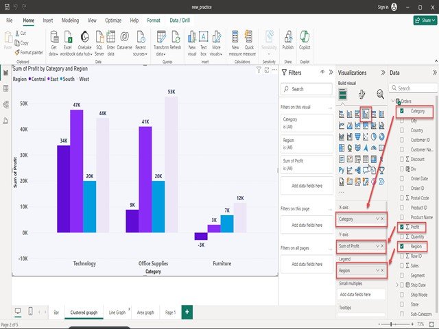
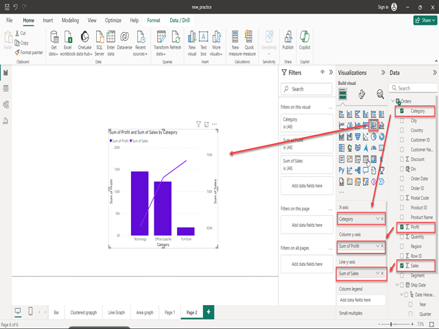
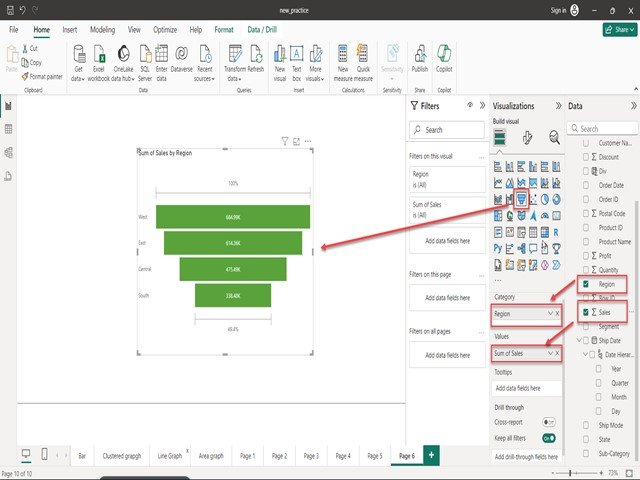
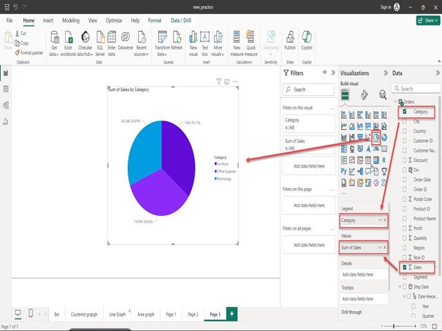
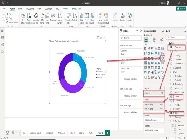
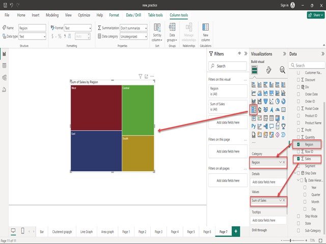
Charts in Power BI
Power BI tools are very famous due to their visualization charts. Microsoft Power BI contains good visualization charts, and those charts play a vital role in representing data within the dashboards. If the data is clearly represented, finding insights will not be difficult at all.
The Power BI generally has 30 different types of charts. However, some of the most important and usable charts are:
- Stacked Bar Chart
- Clustered Bar Chart
- Clustered Column Chart
- Line Chart
- Area Chart
- Line and Stacked Column Chart
- Ribbon Chart
- Funnel Chart
- Pie Chart
- Donut Chart
- TreeMap Chart
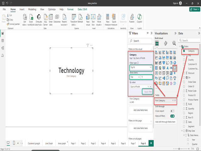
- Card Chart
- Matrix Chart
- Slicer Chart


What is DAX???
DAX stands for Data Analysis Expressions . It serves to drive all calculations in Power BI and Power Pivot in Excel, and in SQL Server Analysis Services. DAX formulas are versatile, dynamic, and very powerful, for they can be used to add new fields and new tables into your model.
Key Points about DAX:
- Data Types:DAX formulas support all numeric data types like integers, decimals, and currency, as well as non-numeric ones, including strings and binary objects.
- Evaluation: DAX expressions are evaluated from the innermost function to the outermost.
- Type Conversion: DAX does automatic type conversion, and at runtime, it casts the result value to the desired data type.
Dax Formulas are mainly made up of three componets write as below.
- Syntax:The correct DAX syntax shares a few elements where all formulas are the same
- Functions:Predefined formulas that take parameters to perform some kind of calculation.
- Context : Specifies which rows to use in a calculation.
Importance of DAX in Power BI
DAX formulae enhance the way you can use your data in Power BI to find fast business solutions. Most simple calculations and display aren’t needed. For example, when you drag the Profit field to the Values section of a chart, Power BI, by default, sums the rows:
However, it’s useful to use DAX under the following conditions:
- Reusability:if a formula is likely to be used across multiple charts, or as a sub-element of other DAX expressions, making reports easier to update.
Complexity:Custom or complex calculations, beyond a simple SUM or AVERAGE function.
DAX Types
DAX is used to define two kinds of expressions and calculations in Power BI. These are:
1. Calculated Columns :Calculated columns are similar to other normal columns but contain one or more functions. They can be used to create filtered or sorted columns from the table.
2. Calculated measures:Calculated measures develop a field of aggregated data, achieving a total, percentage, or average value, etc.
How can we create Calculated Columns ?
Step One : Open the Power BI Desktop and load a sample dataset. On the left pane, click on the table view. See the screenshot below for clarity.
Step Two : Now, click the New Column button. The step is highlighted in the screenshot below.
Step Three : In the Formula bar, type “Column =[col]” and press enter. Your column name will be changed to your desired column name. See the screenshot below for clarity.
How can we create Calculated Measures ?
Step One :Click “New Measure” from the menu in the Modeling area of Power BI Desktop.The step is highlighted in the screenshot below.
Step Two:The words “Measure =” will then appear in the Formula bar. See the screenshot below for that.
Step Three :You can rename “Measure” to anything for any unit of measurement. See the screenshot below for clarity.
Step Fourth :Type the expression to the right of the equals sign. You can rename it by clicking the calculator icon next to the measure’s name in the table.See the screenshot below for clarity
DAX Functions Overview
DAX functions can always be put inside one another to execute as many operations as possible in one formula and thus save much time while writing the formula. You may wish to embed IF upon IF, or even an IFERROR to catch any errors within your calculations.
One of the most used DAX functions in reports are as follows:
- Simple calculations:DISTINCTCOUNT, SUM, AVERAGE, MIN, MAX, COUNT.
- SUMMARISE: RETURNS A table, returned typically to apply aggregations over different groupings
- CALCULATE: Performs an aggregation over all the values that are derived from one or more filter. It goes further to calculate at the point where all the existing filters are TRUE.
- IF:Returns different values depending on the logical test. It’s analogous to the CASE WHEN operation in SQL
- IFERROR:Returns a specified result if a formula results in an error
- ISBLANK: Checks if cells in a column are blank, returns TRUE or FALSE. Useful when used in combination with other functions, for example, IF.
- EOMONTH:Returns the end of a month for a given date; it can be in a future month and even in past months.
- DATEDIFF:Returns the difference between two dates at the number of days, months, quarters, years, etc
Types of DAX Functions
DATE AND TIME FUNCTIONS
These are functions for manipulating dates or time periods given in DateTime format. Following are some of the most used Date and Time functions of DAX, along with their syntax and examples:
DAX CALEND
The CALENDAR function returns a table with a single column of dates. The start_date and end_date arguments can be any DateTime value.
SYNTAX –>
CALENDAR(<StartDate>, <EndDate>)
E.G –>
COUNTROWS(CALENDAR(DATE(2017, 7, 3), DATE(2022, 4, 2))) // it returns 1735
DAX DATEDIFF
The DATEDIFF function calculates the difference between two dates and returns the result based on the specified interval (e.g., hours, days, months).
SYNTAX –>
DATEDIFF(<StartDate>, <EndDate>, <Interval>)
E.G –>
DATEDIFF(DATE(2024, 2, 2), DATE(2024, 3, 31), HOUR) // it returns 71344
DATEDIFF(DATE(2024, 3, 3), DATE(2024, 4, 11), DAY) // it returns 39
DATEDIFF(DATE(2024, 4, 4), DATE(2024, 4, 30), MONTH) // it returns 0
DAX NOW
The NOW function returns the current DateTime value in the standard format. SYNTAX –>
SYNTAX –>
NOW()
E.G –>
NOW() // it returns the current DateTime
DAX DATEVALUE
The DATEVALUE function lets Excel convert a date in text format into a DateTime value
SYNTAX –>
DATEVALUE(<DateText>)
E.G –>
DATEVALUE(“19/11/2023”) // it returns 2023-11-19 00:00:00
DATEVALUE(“20-6-2024”) // returns 2024-06-20 00:00:00
DATEVALUE(“01-Jan-2023”) // it returns returns 2023-01-01 00:00:00
TIME INTELLIGENCE FUNCTION
Time intelligence functions allow the calculation of time values for periods like weeks, months, quarters, and years. These functions mostly deal with aggregation, data manipulation, and Business Intelligence; therefore, a table with dates is usually expected.
DAX DATEADD
The DATEADD function returns a table containing the shifted dates forward or backward based on a specified number of intervals.
SYNTAX –>
DATEADD(<Dates>, <Number_of_Intervals>, <Interval>)
E.G –>
DATEADD(ProductInventory[InventoryDate], 1, YEAR) //This will shift all dates in the InventoryDate column forward one year.
DAX DATSBETWEEN
The DATESBETWEEN function returns a table comprising a column of dates between the start date and end date specified.
SYNTAX –>
DATESBETWEEN(<Dates>, <StartDate>, <EndDate>)
E.G –>
CALCULATE(SUM(Sales[SalesAmount]), DATESBETWEEN(Sales[Date], DATE(2024, 6, 5), DATE(2024, 7, 3))) //This will return the total SalesAmount for a given date range.
DAX LASTDATE
The LASTDATE function returns the last date in the specified column of dates.
SYNTAX –>
LASTDATE(<Dates>)
E.G –>
LASTDATE(Sales[Date]) // It returns last date in the Sales date column
DAX ENDOFYEAR
The ENDOFYEAR function returns the last date of the year in the current context for the specified dates column. Optionally, a different year-end date can be provided. **Syntax:**
SYNTAX –>
ENDOFYEAR(<Dates>, [<Year_End_Date>])
E.G –>
ENDOFYEAR(Start[Date]) //This will return the last date of the year for the Start date column.
LOGICAL FUNCTIONS
DAX Logical functions are used to carry out a logical operation and return a result in TRUE or FALSE form. A few of the DAX logical functions are given below.
DAX AND FUNCTION
The AND function checks whether both arguments are TRUE or FALSE. It will return TRUE only if all arguments are true; otherwise, it is FALSE.
SYNTAX –>
AND(<argument1>, <argument2>)
E.G –>
AND([Country] = “PORTUGAL”, [Medal] = “SILVER”) // Returns TRUE if both conditions are TRUE.
DAX OR FUNCTION
This function will return True if at least one or both of the arguments are True, otherwise it will return False.
SYNTAX –>
OR(<argument1>, <argument2>)
E.G –>
OR([Medal Count] < 50, [Count of Sports] >50) //Returns TRUE if any of the conditions is true
DAX IF FUNCTION
It checks the first argument given in the statement. If True is the condition, the function returns the first value; otherwise, it returns the second.
SYNTAX –>
IF(<condition>, <true_value>, <false_value>)
E.G –>
IF([Country] = “FRANCE”, 1, 0) //Returns 1 if the condition is TRUE; otherwise returns 0.
DAX SWITCH FUNCTION
This function takes arguments and returns one of the listed values against it.
SYNTAX –>
SWITCH(<expression>, <value1>, <result1>, <value2>, <result2>, …, [<Else>])
E.G –>
SWITCH([MONTHS], 1, “JANUARY”,
2, “FEBRUARY”,
3, “MARCH”,
4, “APRIL”,
5, “MAY”,
6, “JUNE”,
7, “JULY”,
8, “AUGUST”,
9, “SEPTEMBER”,
10, “OCTOBER”,
11, “NOVEMBER”,
12, “DECEMBER”,
DAX PATH FUNCTION
This PATH function returns all the identifiers in the oldest as a delimited string.
SYNTAX –>
PATH(<Child_ColumnName>, <Parent_ColumnName>)
E.G –>
PATH(Employee[ID], Employee[ManagerID])
DAX PATHCONTAINS FUNCTION
The PATHCONTAINS function returns True when the given item resides in the specified path, otherwise returning False./p>
SYNTAX –>
PATHCONTAINS(<Path>, <Item>)
E.G –>
PATHCONTAINS(“Emp0001 | Emp0002| Emp0003| Emp0004”, “Emp0005”) // it returns True
DAX PATHLENGTH FUNCTION
This PATHLENGTH function returns how many parents a particular item in the path has.
SYNTAX –>
PATHLENGTH(<path>)
E.G –>
PATHLENGTH(PATH(Employee[ID], Employee[ManagerID]))
DAX FORMULAS
DAX formulas are actually quite intuitive and easy to read. That means the basics of DAX can be grasped quite easily, and you will soon be writing your own DAX formulas. Let us see what makes up the building blocks of proper DAX syntax. .
Total sales = sum(financial sales)
- Name of the measure or calculated column.
- Equal-to operator (“=”) indicates to start the formula.
- A DAX function with opening and closing parentheses (“()”)
- Column and/or table references
- Each parameter in a function separated by a comma (“,”).
“UNKNOWN”) //This returns the month name based on the value of MONTHS.
Mathematical and Trigonometric Functions
These functions are very similar to the mathematical and trigonometric functions of Microsoft Excel. They are used to accomplish all types of calculation in Power BI. Some of the popular mathematical and trigonometry functions are
DAX ABS FUNCTION
It returns the absolute value of the number; it removes the sign of the number.
SYNTAX –>
ABS(<number>)
E.G –>
ABS(-12) // it returns 12
DAX CURRENCY FUNCTION
This function converts a number to a currency data type.
SYNTAX –>
CURRENCY(<value>)
E.G –>
CURRENCY(9.0) // it returns 9.0
DAX SQRT FUNCTION
SQRT function returns the square root of a given number.
SYNTAX –>
SQRT(<number>)
E.G –>
SQRT(81) // it returns 9
SQRT(125) // it returns 5
SQRT(625) // it returns 25
DAX LOG10 FUCNTION
It returns the value base 10 logarithm for a positive number.
SYNTAX –>
LOG10(<Value>)
E.G –>
LOG10(1) // its returns 0
STATISTICAL FUNCTIONS
These are functions in DAX that implement expressions used in statistical models and aggregations. Some are listed below along with their syntax and examples
DAX BETA.DIST FUNCTION
It returns a beta distribution, used for demonstrating the variation in the percentage across the sample.
SYNTAX –>
BETA.DIST(x, Alpha, Beta, Cumulative, [P,[Q]])
E.G –>
BETA.DIST(0.1, 3, 15, TRUE(), 0, 1) // it returns 0.2437
DAX CONFIDENCE.NORM FUNCTION
ONFIDENCE.NORM returns the confidence interval of a sample.
SYNTAX –>
CONFIDENCE.NORM(alpha, deviation, size)
E.G –>
CONFIDENCE.NORM(0.03, 2.3, 40) // it returns approx 0.702165
DAX GEOMAN FUNCTION
The GEOMEAN function returns the geometric mean of a column of values.
SYNTAX –>
GEOMEAN(<column_name>)
E.G –>
GEOMEAN(Sales[Sales_Amount]) // The GEOMEAN function returns the geometric mean of a column of values.
TEXT FUNCTIONS
The text functions allow a user to deal with strings in tables and columns. This allows the obtaining of a substring, carrying out various operations like concatenation of strings. Some of these functions are mentioned below
DAX CONACTENATE FUNCTION
The CONCATENATE function combines two strings into one.
SYNTAX –>
CONCATENATE(<string1>, <string2>)
E.G –>
CONCATENATE(“ROHIT”, ” SHARMA”) //it returns “ROHIT SHARMA”
DAX EXACT FUNCTION
The EXACT function performs a case-sensitive comparison of two strings. It returns TRUE if they’re exactly alike; otherwise, it returns FALSE.
SYNTAX –>
EXACT(<string1>, <string2>)
E.G –>
EXACT(Results[MUSIC], [MUSIC]) // The EXACT function performs a case-sensitive comparison of two strings. It returns TRUE if they’re exactly alike; otherwise, it returns FALSE.
DAX FIND FUNCTION
This function searches for a given string and returns the starting position.
SYNTAX –>
FIND(<find_text>, <within_text>, [<StartingValue>], [<DefaultValue>])
E.G –>
FIND([CRICKETERName],[INFO],, COUNTRY()) // it returns the starting position of [CRICKETERName] within [INFO]; returns COUNTRY() if not found
DAX SUBSTITUTE FUNCTION
The SUBSTITUTE function replaces one or more specified texts with new text in the supplied string.
SYNTAX –>
SUBSTITUTE(<string>, <old_text>, <new_text>)
E.G –>
SUBSTITUTE([SPORTS], “FOOTBALL”, “CRICKET”) // Replaces “FOOTBALL” with “CRICKET” in [SPORTS].
PARENT CHILD FUNCTION
Parent-child functions deal with the data and display it hierarchically. Some of these functions are
DAX Formula Syntax Explained
A DAX formula has a breakdown where each component in the following will be framed, and an example to explain it more clearly is given.
The given DAX expression now makes a new column as illustrated below:
New Column = [Sales Quantity] * [Unit Price]
Now, let’s break it down and learn each element:
- New Column: This will be the name of your new calculated column.
- == (Equal Sign): It simply starts the DAX formula.
- [Sales Quantity] and [Unit Price]: These already exist as columns whose values are being used to make the calculation.
- (*): The multiplication operator. This expression will multiply the values of two columns.
Example: Calculated Column for Total Revenue
Now, create a calculated column for “Total Revenue” by multiplying column “Units Sold” by column “Unit Price”. :
Total Revenue = [Units Sold] * [Unit Price]
Breakdown:
- Total Revenue: What we’re going to call our new calculated column.
- =: Begin the formula.
- [Units Sold]: Column containing the number of units sold.
- [Unit Price]: Column containing price per unit.
- (*): Multiply “Units Sold” and “Unit Price” to get “Total Revenue”.
Further Example: Calculation of Profits
Another useful example could be the calculation of profit, wherein profit is defined as total revenue less total cost. The DAX formula is given below:
Profit = [Total Revenue] – [Total Cost]
Explanation:
- Profit: T Columns to be newly calculated.
- =: Start of DAX formula.
- [Total Revenue]: Column Name of Total Revenue.
- [Total Cost]:Column Name of Total Cost.
- (-):Subtracting Total Cost from Total Revenue to Calculate Profit.
Mastering these elements will enable you to create complex DAX formulae to help you in your specific data analysis requirements.
Operator | Meaning |
= | Equal to |
== | Strict equal to |
> | Greater than |
< | Smaller than |
>= | Greater than or equal to |
<= | Smaller than or equal to |
<> | Not equal to |
Text Operator
Operator | Meaning |
& | Concatenates text values |
Operator | Meaning | Example |
&& | AND condition | ([City] = “Bru”) && ([Return] = “Yes”) |
|| | OR condition | ([City] = “Bru”) || ([Return] = “Yes”) |
IN {} | OR condition for each row |
DAX CONTEXT
In DAX, “context” refers to the environment in which a DAX formula is evaluated. There are at least two types of context: row context and filter context. Therefore, knowledge of these contexts is very essential to write correct, efficient DAX formulas.
ROW CONTEXT
Row context is the current row being processed when reading a table. Each time you create calculated columns or use functions like SUMX, AVERAGEX, etc., the formula is evaluated for each row in a table.
Example of Row Context
Suppose you have the table Sales with the following columns:
- Product
- Units Sold
- Unit Price
You want to compute the total sales for each row by multiplying the Units Sold column by the Unit Price column:
Total Sales = [Units Sold] * [Unit Price]
In this formula, each single row of the Sales table is a row context. Yes, the calculation is performed for each row individually..
FILTER CONTEXT
Filter context refers to a collection of filters that are in force against data. This comes into play when measures and calculated columns are used in a report. Slicers, filters, and other data model relationships create filter context.
Example of Filter Context
Now, consider this very Sales table. You need to get the total revenue for any given product::
Total Revenue = CALCULATE(SUM(Sales[Total Sales]), Sales[Product] = “Product A”)
In this formula:
- SUM(Sales[Total Sales]): This measure will sum Total Sales.
- CALCULATE: Modifies the filter context.
- Sales[Product] = “Product A”: Apply a filter to include only those rows where Product is “Product A”
The formula returns the grand total of revenues corresponding to “Product A,” by changing the filter context to include only relevant rows.
Combining Row Context and Filter Context
Quite often, in a single DAX formula we use both row context and filter context. For example, the use of SUMX within CALCULATE:
Total Revenue = CALCULATE(SUMX(Sales, Sales[Units Sold] * Sales[Unit Price]), Sales[Product] = “Product A”)
This is the formula:
- SUMX(Sales, Sales[Units Sold] * Sales[Unit Price]): As we saw earlier, this will iterate over each of the rows in the Sales table—which has a row context—to calculate Total Sales.
- CALCULATE: The filter context is changed into only rows where the value of the Product column is “Product A”. .
Example in Power BI
Imagine that you have a table Sales and another table called Date. You would want to know the total sales for a specific year. In this case, the filter context will be different based on the year selected in a slicer.
Total Sales for Year = CALCULATE(SUM(Sales[Total Sales]), Date[Year] = 2023)
This example calculates the following:
- SUM(Sales[Total Sales]):The total sum of Total Sales.
- CALCULATE: Changes the filter context to only include the rows where ‘year’ is 2023.
Grasp and make use of the row context and filter context to provide you with the ability to come up with powerful and dynamic DAX formulas that will allow the analysis and visualization of your data.
Understanding the Data Modeling
Data modeling is the process of structuring data into a diagram, along with relationships and details of single attributes. Classify your data elements to establish relationships and Develop Calculated Fields and Measures in order to Extract Meaningful Information. This enhance data reliability, reduces redundancy and increase reusability across numerous reports and dashboards, hence it becomes intrinsic for effective analysis and visualization within Power BI.
Concepts of data modeling in Power BI:
- Tables: and Data organized in rows and columns; often referred to as fields or values. Each table typically represents some area of business, like sales transactions, customer accounts, product details, or purchase orders.
- Relationships :Links between two tables possessing common fields that relate them, allowing for consolidation of data across those tables in meaningful ways. Power BI supports the following relationship types.
Basically, there are three types of relationships:
- One to One : One key in one table is associated with one key in another table.
- One to Many :One key in one table is related to multiple related keys in another table.
- Many to Many :Multiple keys in one table relate to multiple keys in another table.
- Calculations :Calculations play an important role in deriving meaning. Power BI uses DAX to conduct several operations, including aggregation, comparison, and analysis, which result in producing KPIs relevant in business functions and decision-making.
How can we build our data model in Power BI Desktop:
Open Power BI Desktop.
Click “Get Data“.
Then select your particular data source. A window will pop up asking you to select a specific file on your computer. Import the file which you have selected

, then go into the “Model” view by selecting this icon in Power BI.
See below the screenshot of how we can select Model View.
After clicking on Model view, you should see something like the screenshot below.
Sometimes, Power BI might detect a relationship between tables and hence create links. You may use those links or delete them based on your requirement.
Create Table Relationships : Intro About Table Relations:
A table relationship is created between two or more tables using one common attribute. This will be instrumental in the smooth access of data across different tables on Power BI, thus fostering efficient data analysis and reporting
There are four kinds of table relationships in Power BI:
- One-to-One: Each entity in table A links to exactly one entity in table B. In the light of this explanation, one could visualize one student per class.
- One-to-Many:Each entity in table A can relate to many entities in table B. Taking an example, one student with many activities.
- Many-to-One (*:1): Several things in table A relate to only one thing in table B. For instance, many students are in one class.
- Many-to-Many (*:*): Many things in table A may relate to many things in table B—for example, many students having many hobbies
How to Create an Table Relation:
Step One: Open Power BI Desktop and Click On Enter Data
Step Two: Create your table with the specific data that you want to insert.
Insert the records and then click on load to save the table.
Create another table to relate them..
Step Three: After tables are created, click “Manage Relationships” to create the relationships between them.
Manage Relationships A dialog box will open which gives a relationship between the table.
Creating Relationships Using AutoDetect
Manage Relationships wll bring up a dialogue box that confirms no relationships are defined.
Click “Autodetect”; it will automatically detect the relationships and show them.
Create table relation Manually
In Power BI, creating a new relationship is accomplished using the “New” button on the “Manage Relationships” dialog box.
Look at the Screenshot Below.
Select table names and corresponding attributes to relate it.
For example “name” and “birthplace” from selected tables and select the cardinality which type of table realtion you want, then click on Save.
Click on “Model view” to see the relationship between “cricket” and “cricket@” via “name” and “birthplace.”
This shows the relationship between “cricket” and “cricket@” via “name” and “birthplace”.
How Does Star Schema Work???
A star schema literally takes the shape of a star, with a center fact table surrounded by dimension tables on all sides. Even though attaching only one fact table to a data model is recommended, Power BI allows more than one fact table in case it is necessary.
Look at the below Screenshot for better understanding
A fact table should contain summarized or aggregated numerical values that have keys to each dimension table. This enables the keys to hook up the tables in a simple and clean way. For optimal model performance, numeric values are recommended instead of text strings, especially with large or complex data models. Fact tables by dimension should be narrow, with few columns. Descriptive analytical attributes, like Product Name or Product Category, would normally get moved into separate dimension tables, as if they hadn’t already been separated in the data warehouse. This process is called normalization of data, reducing redundancy. These dimension tables categorically describe dataset attributes, logically grouped to prevent table bloat and to easily create the relationships in the Power BI report. These are such tables that contain unique values and columns of data used for filtering and grouping. An extension of the star schema is the snowflake schema, wherein each dimension table can, in turn, be split, if the attributes have extra categories or even subcategories. For example, Products will have one table containing only Product ID and Product Name, while Product Category will be placed in another, with its own unique identifier called Product Category ID.
Look at the below Screenshot for better understanding
What is Cardinality???
Cardinality refers to the relationship types between tables in data modeling. Here are the three major cardinalities
- One-to-One (1:1):A record in Table A can relate to only one record in Table B.
- One-to-Many (1:*):One thing in table A will relate to many things in table B. For example, one student doing many activities.
- Many-to-One (*:1):Many entities in table A relate to one entity in table B; for example, many students belong to one class.
- Many-to-Many (*:*):Many entities in table A are related to many entities in table B, such as many students having many hobbies.
Look at the below Screenshot for better understanding.
What is Cross- Filter Direction???
The direction of a cross-filter defines how filters apply between connected tables.
- Single:Under single, the filters apply in one direction and affect the table in which values are aggregated.
- Both:The filters are two-way, and both consider the connected tables to be one.
Introduction about Power Query:
Power BI reports are full of advanced features, allowing users to provide elaborate analysis with insight. They let them drill deep into the data and ad hoc analysis of different dimensions with interactive tools like drill-through, filtering, and highlighting.
Reports in most cases will have several pages or tabs dealing with the complexities in visualizations and elements. Users would go through those pages by means of buttons and bookmarks to details of aspects of data; progressive disclosure—important information is shown by default, and additional details are revealed upon interacting with it, similar to working with an app.
Reports support advanced data modeling with Custom Measures, Calculated Columns, and DAX to treat complex calculations. More often than not, these reports focus on historical data to give a big picture of tendencies, and they need refreshes now and again. Power BI thus supports scheduled refresh for refreshing data at regular intervals..
Key aspects about Power Bi Reports
- Power BI reports are interactive visualizations built using Power BI Desktop.
- There you will connect to data and then transform and shape it, build visualizations, do adding of elements and create relationships, before finally publishing and sharing the report.
- Reports provide an in-depth view and are fully customizable and shareable.
- Dashboards offer a quick summarization view of key metrics from multiple reports for real-time monitoring.
- Reports focus on the detailed level of analysis; dashboards focus on the high level of monitoring.
Introduction about Power BI Reports:
Power BI reports are full of advanced features, allowing users to provide elaborate analysis with insight. They let them drill deep into the data and ad hoc analysis of different dimensions with interactive tools like drill-through, filtering, and highlighting.
Reports in most cases will have several pages or tabs dealing with the complexities in visualizations and elements. Users would go through those pages by means of buttons and bookmarks to details of aspects of data; progressive disclosure—important information is shown by default, and additional details are revealed upon interacting with it, similar to working with an app.
Reports support advanced data modeling with Custom Measures, Calculated Columns, and DAX to treat complex calculations. More often than not, these reports focus on historical data to give a big picture of tendencies, and they need refreshes now and again. Power BI thus supports scheduled refresh for refreshing data at regular intervals..
Key aspects about Power Bi Reports
- Power BI reports are interactive visualizations built using Power BI Desktop.
- There you will connect to data and then transform and shape it, build visualizations, do adding of elements and create relationships, before finally publishing and sharing the report.
- Reports provide an in-depth view and are fully customizable and shareable.
- Dashboards offer a quick summarization view of key metrics from multiple reports for real-time monitoring.
- Reports focus on the detailed level of analysis; dashboards focus on the high level of monitoring.
Importance of Report Designing:
Designing reports and dashboards has become easy nowadays with the presence of numerous business intelligence platforms. However, business reports really do not deliver any business value most of the time.
Here are good design practices to make sure your reporting is relevant to aid key business decisions. A good report should make it easier to:
- Simplify complex information.
- Convey insight concisely.
- Elaborate on information only when necessary.
Guidelines for Participatory Report Design
Reports that are engaging, useful, and valuable can be designed with the following properties taken into consideration:
- Chart Selection : One should choose charts relevant to highlight data insights effectively.
- Placement and Spacing: Place the elements appropriately on the report canvas for easy readability and clarity.
- Contextual Clarity:Make sure every visualization is very clear about the importance and relevance of the data represented.
- Formatting Simplicity:Keep away from fanfare by maintaining uniformity in format so that the audience remains focused on your data.
Designing reports and dashboards has become easy nowadays with the presence of numerous business intelligence platforms. However, business reports really do not deliver any business value most of the time.
Here are good design practices to make sure your reporting is relevant to aid key business decisions. A good report should make it easier to:
- Simplify complex information.
- Convey insight concisely.
- Elaborate on information only when necessary.
The Power Query Editor consists of the following four main parts as shown below:
Ribbon : Located at the top, it contains data transformation options.
Queries : Lists all queries for the report, allowing organization into groups.
Data View : Displays the data for the selected query with a preview of the first 1000 rows.
Transformation Steps : Shows each transformation applied to the query in the right-hand pane, allowing for tracking and modification of changes.
See the screenshot below for a preview of what the Power Query Editor interface looks like.
This example financial data has already been cleaned, so no such transformations are required. Common transformation steps though include:
- Deleting rows and columns : remove blank rows / colums added for easier reading.
- Data type conversion : Ensure proper casting of all columns to data type variants of number, date, and text.
- Combining data :The merge and append combine queries from more than one source.
- Pivot and unpivotTransforming data between wide and long formats.
- Conditional column : Create a column based on if/then/else logic.
Steps to use Power Query
Step One : Load Data
Open Power BI . Under the “Home” tab, click the “Get Data” button to select your data source.
Step Two:
Open Power Query Editor and , click on “Transform Data,” after the data loads.
Step Three :Inspect Data
Review the loaded data in the main data view to understand its structure and quality.
Step Four : Apply Transformations
Remove unnessary rows/columns, correct data types, filter data, split/merge columns, pivot/unpivot data, and add conditional columns.
Step Five :Save and Load Data
Once you carry out the transformations, click “Close & Load” in Excel or “Close & Apply” in Power BI to save and load clean data into the worksheet or report.
How to Create Reports ???
Below are steps on how to create a Power BI report:
- Source Data Connection: In Power BI Desktop, you are able to connect to a wide array of data sources, from databases and Excel files to online services and cloud-based platforms. You may either import the data or make a live connection to the source of the data.

- Data Transformation:Use Power Query Editor to transform and clean up your data. This constitutes the calculation, row filtering, making calculated columns, and table merging, amongst many other tasks that can be done in the editor to put the data in the correct view for analysis.
- Data Visualizations : Drag and drop the fields from the data pane to the report canvas and drop it to build the visualizations. Use relevant visualization types, format them, add filters and interactions in the report to make it dynamic.
- Report Formating :Enhance information within this report using headers, text boxes, pictures, shapes, and any other type of design to provide context and explanation.
- Publishing:Once the report is complete, use the Publish option in Power BI Desktop to publish the report to the Power BI service.
- Sharing:You can share these reports with a user or group, work collaboratively, embed into an application, and schedule data refresh by using services within Power BI. The design of the Power BI reports plays a colossal role in building up an effectual user-centric visualization. This might, however, be carried out efficiently by understanding the requirement of the business, proper visualization, doing the logical layout, good user-friendly design, enhancing the user interaction, and performance optimization.
Introduction about Power BI Dashboards:
Power BI dashboard is supposed to be a one-page, fully interactive canvas of visuals that are intended to make your insights shine effectively. Unlike multi-page Power BI reports found in Power BI Desktop and Power BI Service, Dashboards are not.
- Interactivity and Accessibility: Dashboards enables rich interactivity and accessibility across the enterprise for a variety of formats. They summarize the deep metrics in multiple datasets, on-premises, or cloud-based.
- Display of Focus: A dashboard front-pages only the most important metric values in an organization; hence it is very effective in an interactive analytics solution.
Types of Power BI Dashboards
- Operational Dashboards: Operational dashboards focus on the activities executing day by day and their related performance metrics. They are dynamic views of KPIs to deliver insight in real-time pertaining to business operation execution. A retail dashboard, for example, might show sales, inventory levels, and customer satisfaction metrics in one view
- Strategic Dashboards:Strategic dashboards align business strategies with a visual display of data in support of long-term planning and decision making. For example, a marketing team could leverage a strategic dashboard to keep pace with campaign performance, audience engagement, and conversion rates.
- Analytical Dashboards: Analytical dashboards drill into trends and tendencies in data sets; for example, leveraging some of the artificial intelligence features baked right into Power BI for extracting further insights. For example, a finance department might have an analytical dashboard set up to understand expenditure trends, forecasts related to revenues, and financial modeling.
How We Can Create Dashboards In Power BI???
There are three major steps to creating a dashboard in Power BI Desktop: connecting to data sources, designing the visualizations and customizing, and sharing/publishing the dashboard. Let’s run through each of the steps below:
- Step 1: Connect to Data Sources –> Open Power BI Desktop and connect to your data sources. This could be from Excel spreadsheets or SQL databases, etc., down to services in the cloud like Salesforce or Google Analytics. It’s not hard to get access to all of them with the help of Power BI Desktop. Then, it flawlessly brings in your data into the application.
- Step 2: Designing and Customizing Visualizations –> Design and customize visualizations in Power BI Desktop once you have connected to your data sources. Show your data as charts, graphs, tables, maps, and more. Modify the color palette, change fonts, and other designs to your liking and the explicitness you want to achieve.
- Step 3: Share and Publish the Dashboard –>Now that you have designed your dashboard, share and publish it. You can share it with other Power BI users in Power BI Desktop or even publish it on the web to be accessed by more users. You can also set up an automatic refresh of data so that your dashboard reflects data on a real-time basis.
Importing Data in Power BI Desktop for Dashboard Creation
After connecting to your data source, you will import the data into Power BI Desktop. Power BI Desktop provides tools for shaping and transforming your data and making it ready for visualization. Here are the steps to import data:
- Connect to a Data Source : Connect to the data source in Power BI Desktop.
- Import Data: Use Power BI Desktop tools to import and shape your data for visualization.
Before loading your data, relate tables so that you can combine data from multiple sources in a single visualization. Advanced data modeling features include calculated columns and measures created in Power BI Desktop to provide more depth and insight into visualizations.
Power BI Desktop supports a large number of data sources, Excel files, and SQL Server databases to cloud services like Salesforce or Google Analytics. This makes it very flexible in terms of connection to your data, wherever it may be.
Design and Customize Visualizations of Your Dashboard
Following the importation of data into the Power BI Desktop, you can design your visualizations for your dashboard. It’s achievable in Power BI Desktop, having availability of several visualization types and multiple choices on how to make a custom visual. Here are some pointers:
- Know your audience:Understand the purpose of your dashboard and who it is for. Then, choose the types of visualizations that will enable them to get information in the best way possible. For example, complex visualizations, such as heat maps or tree maps, will be used for high-level executives.
- Experiment and Customize :You can freely experiment with different kinds of visualizations and other design elements until you get the feel. In Power BI Desktop, it is easy to change over to alternative visualizations and further customize them. Adding more specialized visuals available from the Power BI marketplace will take your dashboard to the next level.
Make Your Dashboard Interactive with Filters and Slicers
One of the ways in which users can really leverage dashboards in Power BI is by making them interactive. Within Power BI Desktop, there are a variety of tools that a developer can use for enhancing interactivity: filters, slicers, and drill-throughs. Some basic considerations would be:
- Basic filters :Use these to constrain the data shown within your visualizations. Filters can be applied at many levels: visualization, page, or even report.
- Slicers:They are visual widgets that will help a user in dynamically choosing options to refresh the views on the dashboard. They are an intuitive means to filter data.
- Drill-throughs:Provide the ability to drill through to details of data views so that users are able to navigate to detailed-oriented views of it. This is useful in taking a close look at any given part of your data.
With these interactive features, you will be in a good position to deliver a more exciting and enlightening dashboard experience to the users.
Creating Calculated Columns and Measures for Advanced Analytics
Power BI Desktop provides a series of functions and formulas that can be used for in-depth analysis. In this regard, one can create columns, measures, and tables to derive meaningful insights from data. The following are some of the tips:
- Understand the Difference: A calculated column is mostly used to perform row-level calculations and gets pre-calculated in the data model; measures are used to perform aggregations which get calculated on the fly.
- Apply DAX Functions:Rich in language Data Analysis Expressions, allowing for the definition of complex calculations and aggregates.
- Optimize Performance: Be mindful of the performance when developing any calculation; too complex a formula may reduce the speed of your report.
Appropriately using calculated columns and measures can enhance the analytical capabilities of your Power BI dashboards.
Share and Publish Your Dashboard with Others over the Web or on Mobile Devices
The final steps in building a dashboard using Power BI Desktop are centered around sharing and publishing. It enables others to easily access your dashboard on the web or with mobile devices. Consider these tips:
- Publish to Power BI Service: Publish your dashboard into the Power BI service so it can be accessed online.
- Set Up Permissions:Set up proper permissions so that only some people can view or edit your dashboard.
- Enable Mobile View:Your dashboard will be correctly displayed even on mobile devices, therefore you will have a good user experience even on-the-go.
- Schedule Data Refreshes:Automate the refreshes of data to keep it updated with the latest information on your dashboard.
By these steps, you will efficiently share your Power BI dashboard with more audiences.
What is Pivot Table in Power BI???
Power BI pivot tables are very useful in fast summarizing vast data and analyzing it. Secondly, they provide flexible options for grouping, filtering, sorting, and aggregation of data according to one’s preference for identifying trends and patterns. Easy customization and formatting help change the layout and design at your will for the easy presentation of findings. Refreshing a pivot table updates it with new data, thus keeping your analysis current without requiring manual updates. Overall, pivot tables save time and provide insight—thus, with Power BI, a very great tool for analysis is realized.
Why we use Pivot Table???
Pivot tables in Power BI are invaluable for quickly summarizing and analyzing large datasets. They offer flexible options for grouping, filtering, sorting, and aggregating data, helping you identify trends and patterns. Their easy customization and formatting allow you to tailor the layout and design to fit your needs, making it easier to present findings. Pivot tables can be refreshed with new data, keeping your analysis up-to-date without manual updates. Overall, pivot tables save time and provide valuable insights, making them a powerful tool for data analysis in Power BI.
How to create an Pivot Table in Power BI
In a nutshell, it is quite easy and user-friendly to create PivotTables in Power BI for any person who wants a quick summary or in-depth analysis about data. Here is a step-by-step procedure on how to create a PivotTable:
- Step One: Load an Data to the Power BI –>The very first step to visualize data using Power BI is to open Power BI Desktop and load the desired Data source. . Here, it is very supportive to many sources, including Excel files, CSV files, SQL Server databases, and others, gaining an advantage of working with several platforms’ data.
- Step Two : Open Report Tab –>On the left side of your screen, click on the tab “Report.” It is your main workspace, and from there, you create and edit your report.
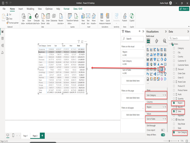
- Step Three : Choose Matrix Visual –> Click “Visualizations” on the left and select the last option, “Matrix Visual,” from the list of visualization options. This is what allows one to work out a pivot table in Power BI.
- Step Four : Add Fields –> Drag and drop the fields you want to use in your pivot table from the “Fields” pane into areasiable, respectively, with labels of “Rows,” “Columns,” and “Values.” This step allows you to organize and categorize your data according to your analysis needs.
- Step Five : Apply Aggregation –>Apply the appropriate Aggregation function depending on the nature of your data. Power BI holds different aggregation functions like sum, average, count, and many more, which could let you do all sorts of calculation and derive lots of useful information from your data.
- Step Six : Format Table –> You can further customize this PivotTable by font size, color, and other display options. The formatting tools within the “Visualizations” pane will help to create a nice, clean-looking, readable report.
- Save and Share: Lastly, save your report to save and share your work. Power BI also has share features so that you would be able to share the report with people within your organization, hence promoting teamwork and informed decision-making.